
Discover Our Portfolio: Where Creativity Meets Excellence
At Graphic Visual Studio, we are driven by the belief that design is a powerful catalyst for brand elevation and the creation of unforgettable experiences. With expertise in graphic design, packaging design, layout design, logo creation, video design, and prepress, we are dedicated to transforming your ideas into visually striking masterpieces that captivate, engage, and leave an indelible mark on your audience.
Dizajn Pakovanja
Packaging is more than a container — it is often the first physical interaction between a brand and its audience. Through a combination of branding, packaging engineering, and production expertise, I develop packaging solutions that elevate perception, enhance market presence, and deliver a consistent brand experience across every touchpoint. What We Deliver: Packaging Design Systems; Label Design; Structural & Visual Packaging Concepts; Packaging Adaptation & Line Extensions; Print-Ready Artwork & Specifications; Art Direction for Product Presentation
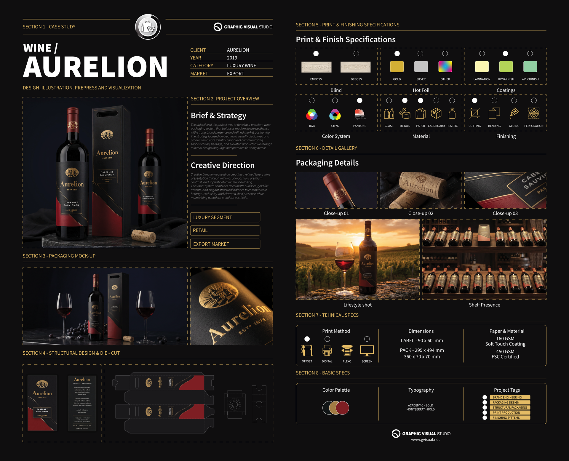
Luxury Wine Aurelion
Creative Direction focused on creating a refined luxury wine presentation through minimal composition, premium contrast, and sophisticated material detailing.
The visual system combines deep matte surfaces, gold foil accents, and elegant structural balance to communicate heritage, exclusivity, and elevated shelf presence while maintaining a modern premium aesthetic.
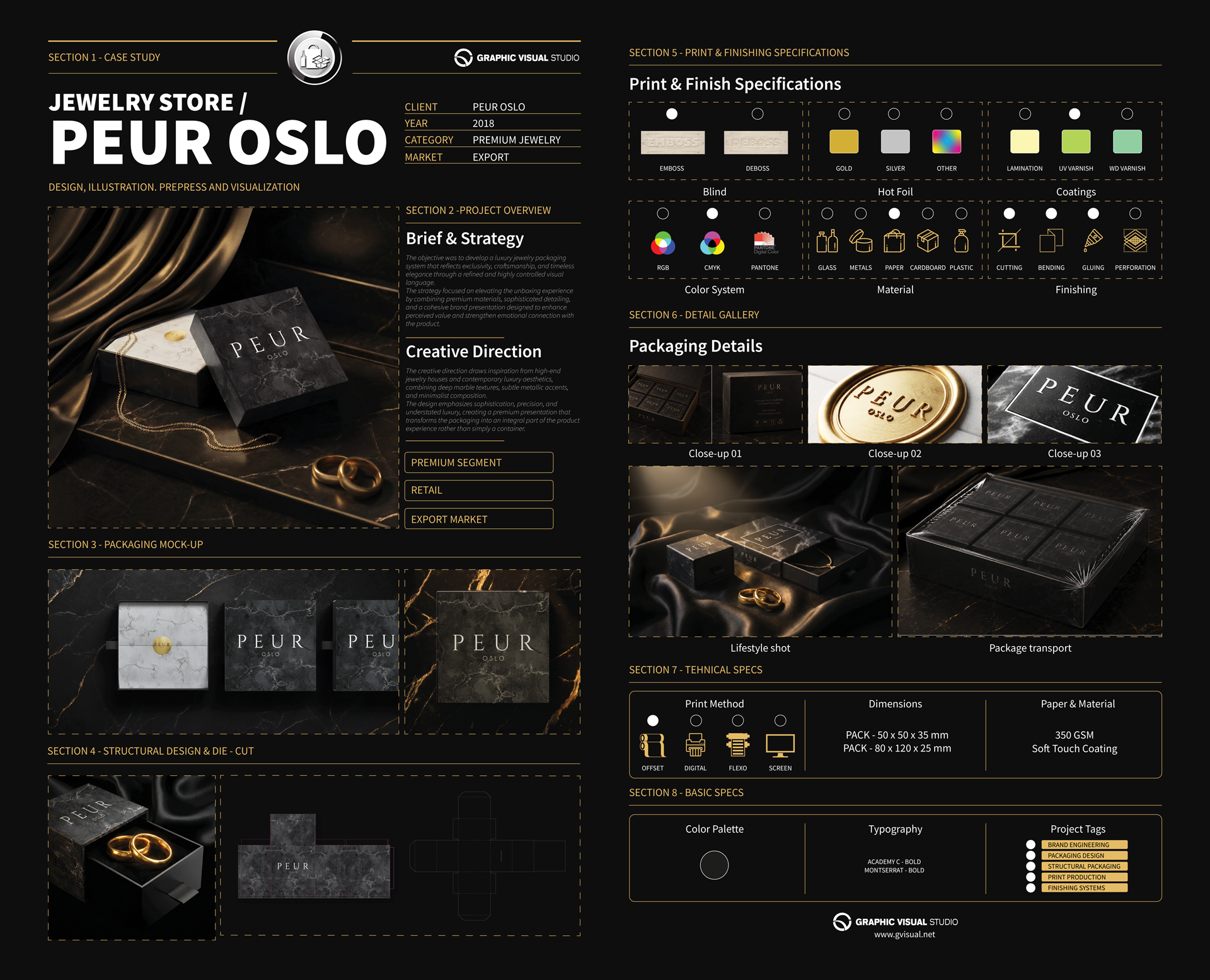
Luxury Jewelry Peur
The creative direction draws inspiration from high-end jewelry houses and contemporary luxury aesthetics, combining deep marble textures, subtle metallic accents, and minimalist composition.
The design emphasizes sophistication, precision, and understated luxury, creating a premium presentation that transforms the packaging into an integral part of the product experience rather than simply a container.
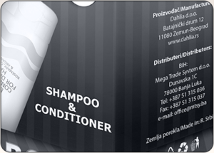
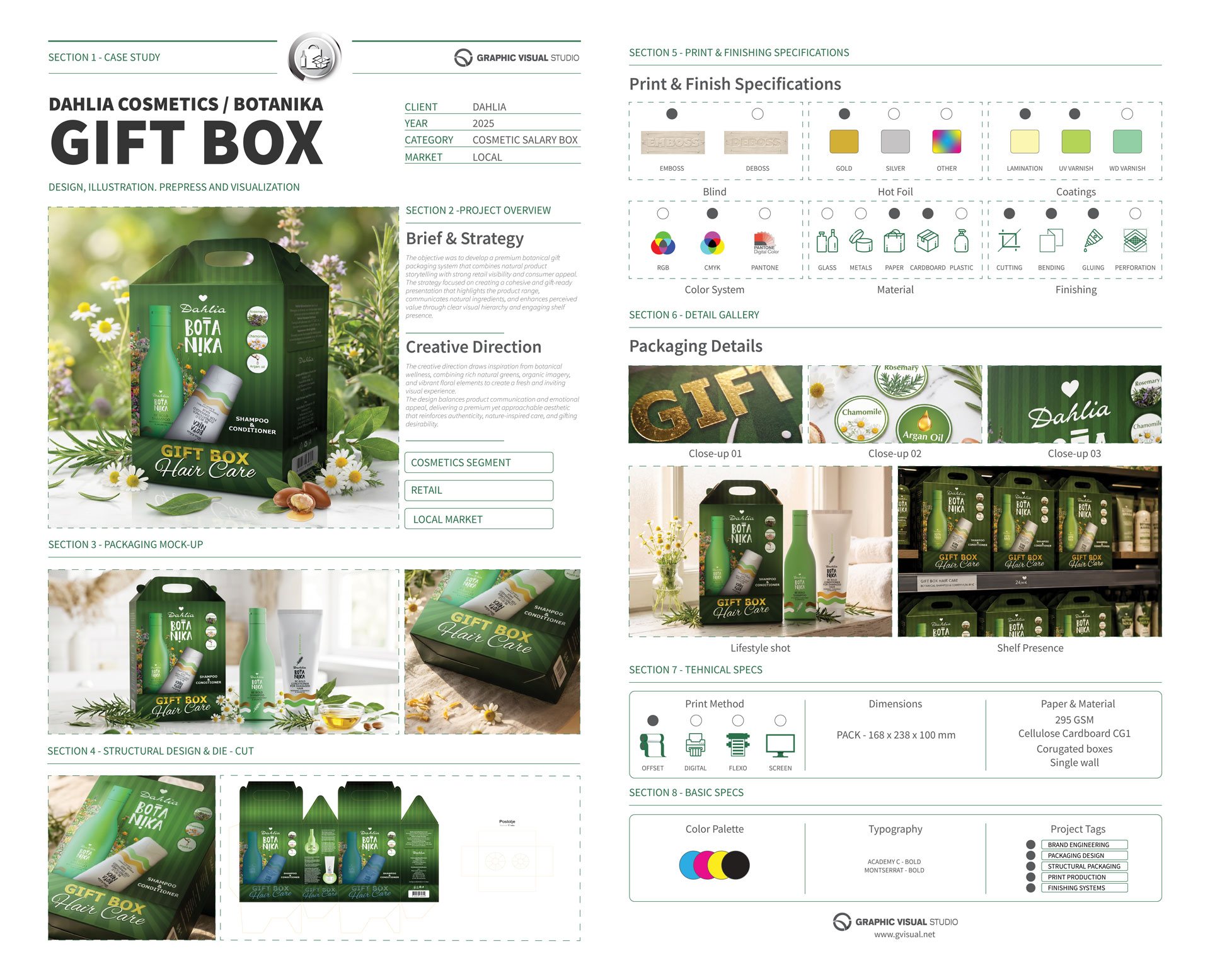
Premium Botanika Gift box
The creative direction draws inspiration from botanical wellness, combining rich natural greens, organic imagery, and vibrant floral elements to create a fresh and inviting visual experience.
The design balances product communication and emotional appeal, delivering a premium yet approachable aesthetic that reinforces authenticity, nature-inspired care, and gifting desirability.
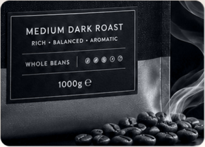
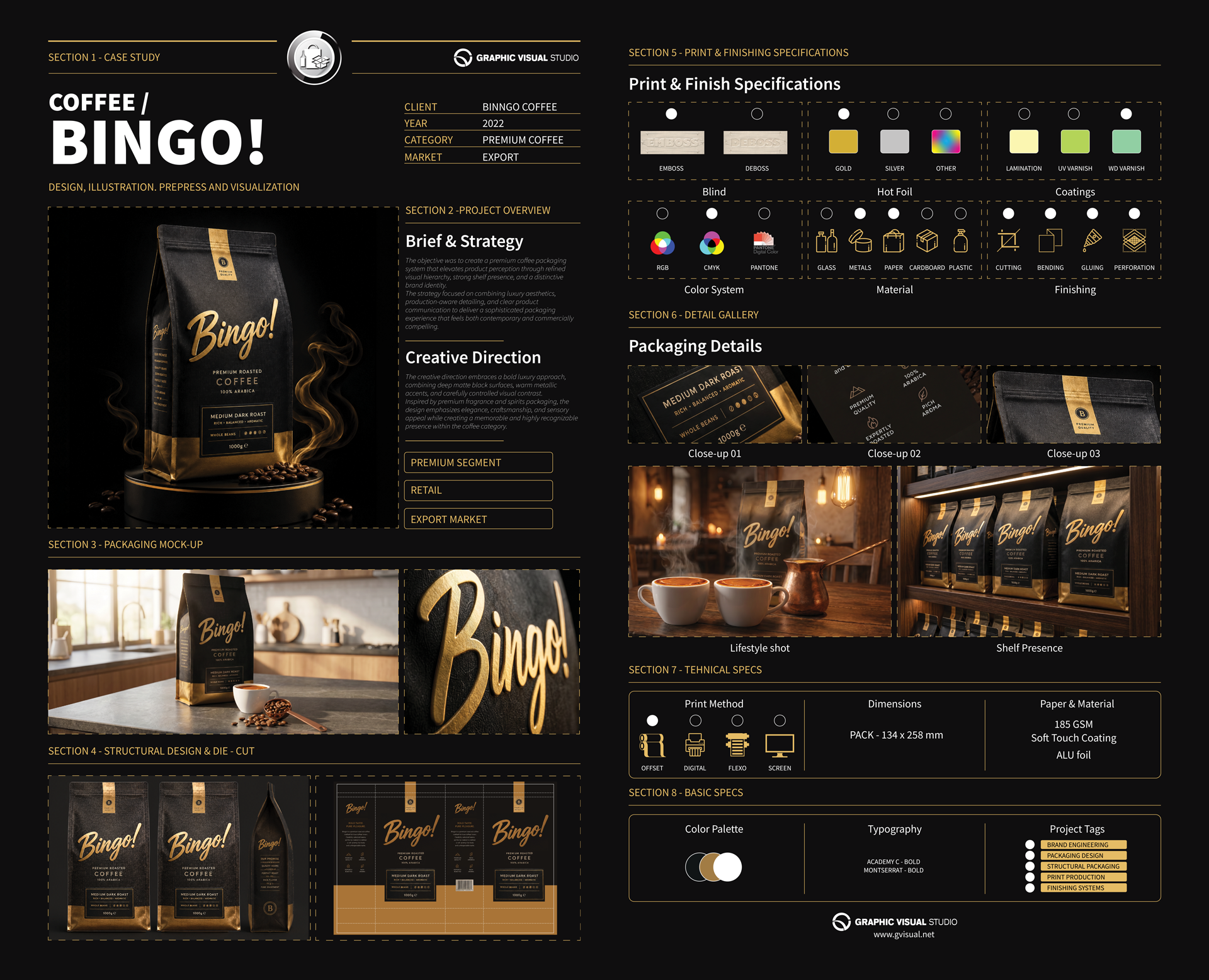
Premium Coffee Bingo!
The creative direction embraces a bold luxury approach, combining deep matte black surfaces, warm metallic accents, and carefully controlled visual contrast.
Inspired by premium fragrance and spirits packaging, the design emphasizes elegance, craftsmanship, and sensory appeal while creating a memorable and highly recognizable presence within the coffee category.
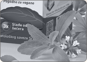
Natural Sweetener PreviaPlus
The creative direction draws inspiration from botanical wellness and natural nutrition, combining fresh green tones, organic ingredient cues, and clean visual hierarchy.
The design balances healthcare credibility with approachable lifestyle aesthetics, creating a modern and trustworthy identity that reflects purity, natural sweetness, and conscious daily consumption.
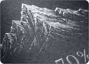
Premium Chocolate Mareno
The creative direction draws inspiration from luxury confectionery and fine artisanal products, combining deep matte surfaces, elegant gold detailing, and sophisticated material textures.
The design emphasizes refinement, authenticity, and sensory richness, creating a premium visual experience that reflects the quality of the product while reinforcing a timeless and distinctive brand presence.
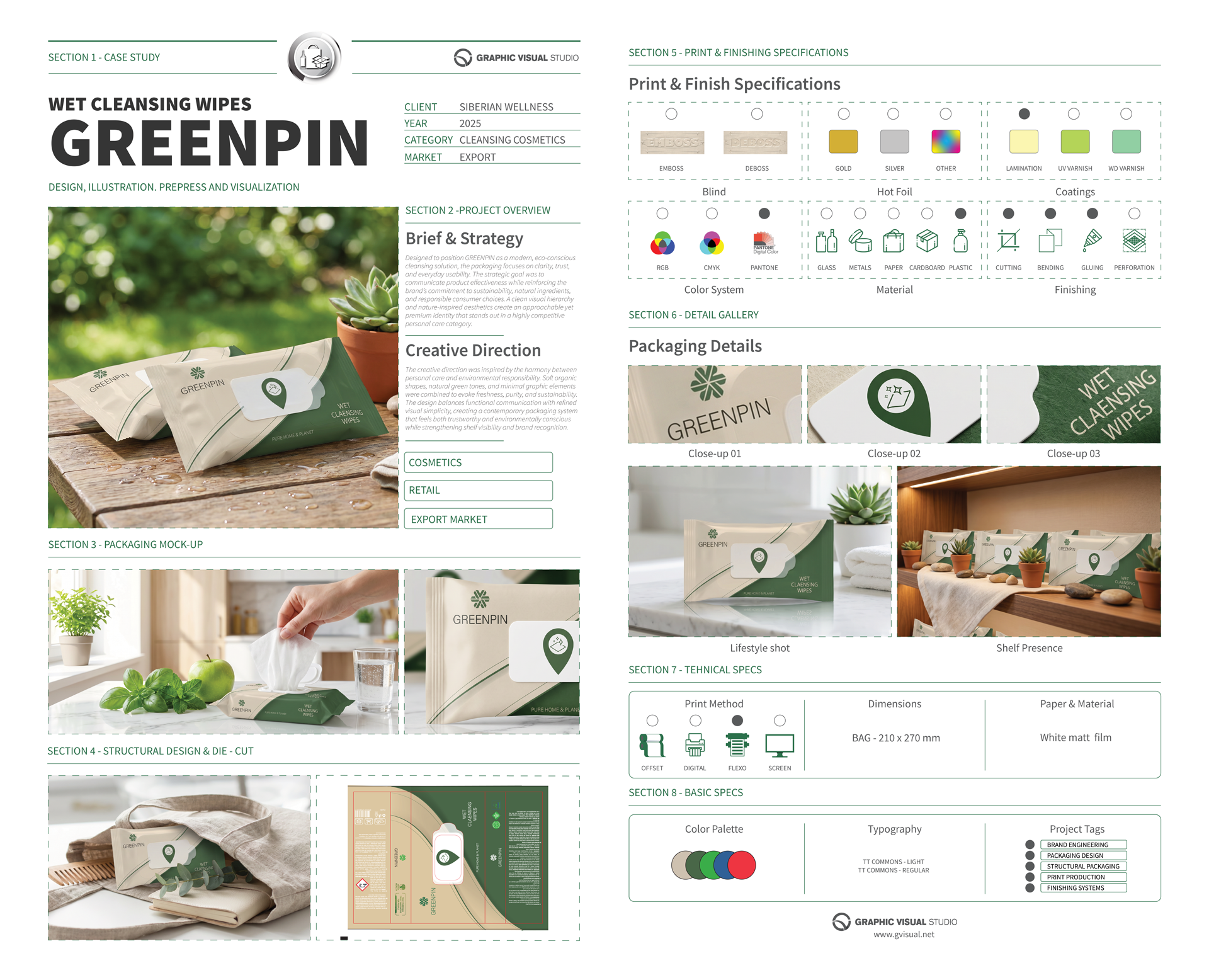
Wet Cleansing wipes GreenPin
The creative direction was inspired by the harmony between personal care and environmental responsibility. Soft organic shapes, natural green tones, and minimal graphic elements were combined to evoke freshness, purity, and sustainability. The design balances functional communication with refined visual simplicity, creating a contemporary packaging system that feels both trustworthy and environmentally conscious while strengthening shelf visibility and brand recognition.
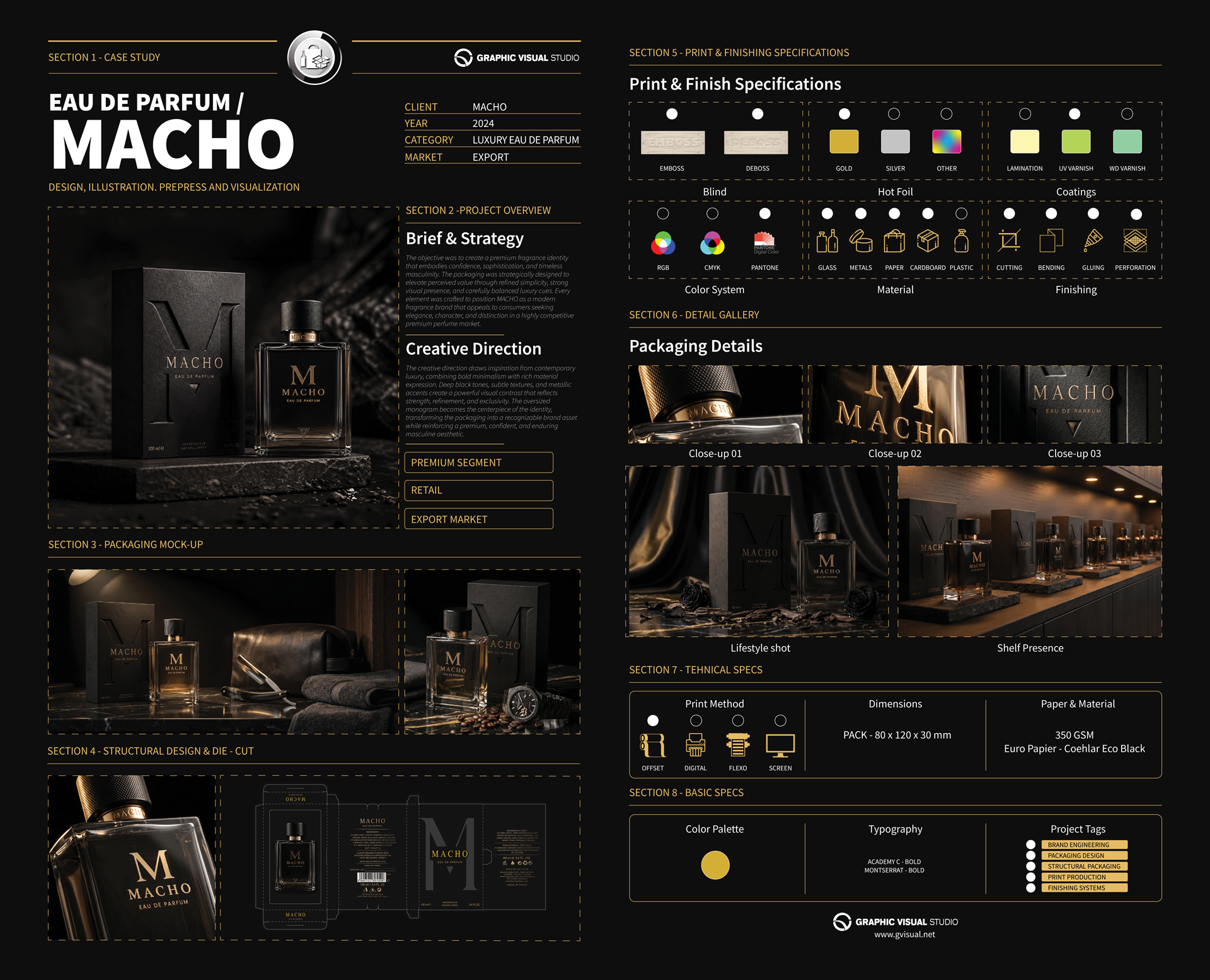
Eau de parfum Macho
The creative direction draws inspiration from contemporary luxury, combining bold minimalism with rich material expression. Deep black tones, subtle textures, and metallic accents create a powerful visual contrast that reflects strength, refinement, and exclusivity. The oversized monogram becomes the centerpiece of the identity, transforming the packaging into a recognizable brand asset while reinforcing a premium, confident, and enduring masculine aesthetic.
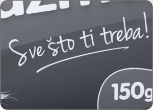
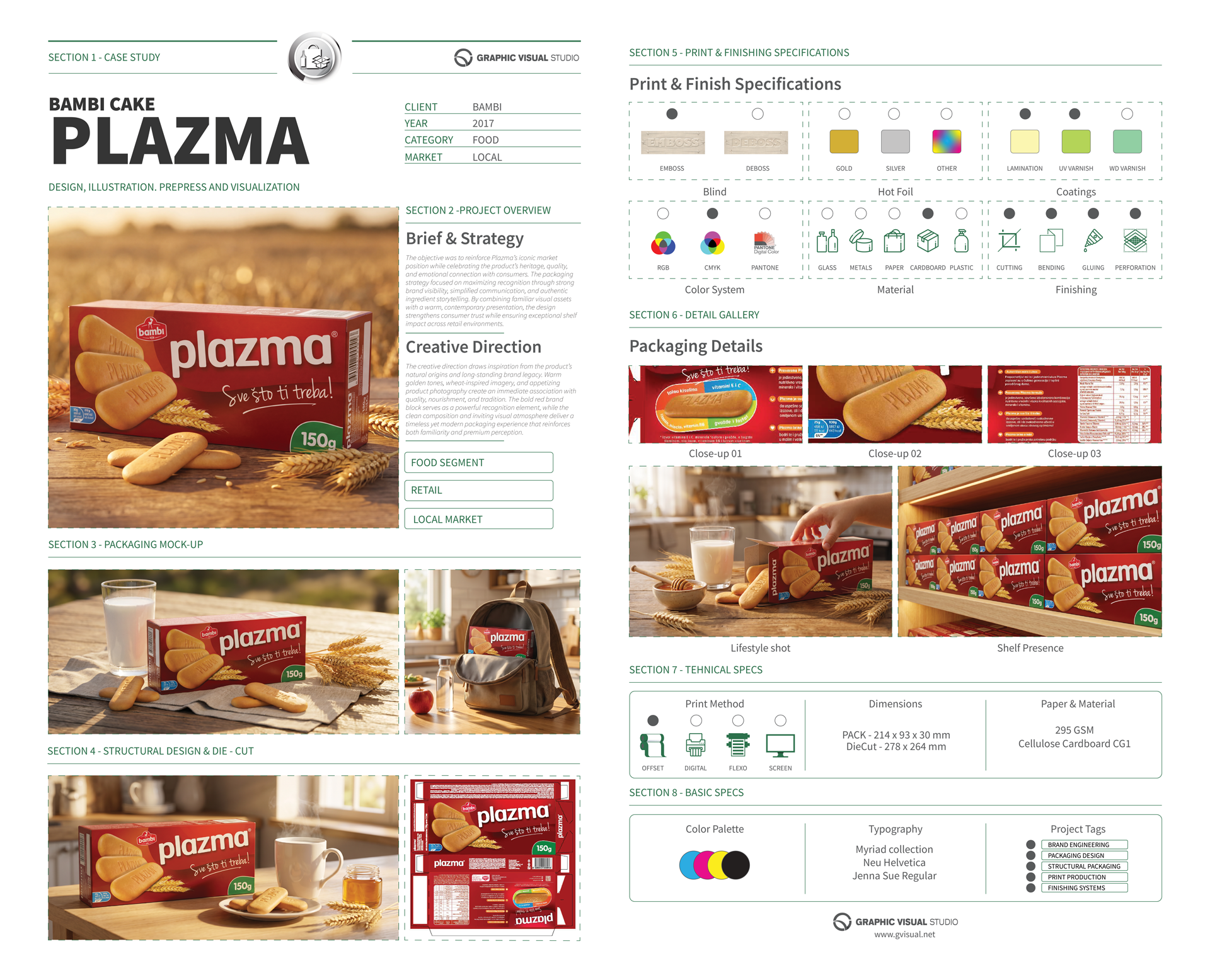
Bambi Plazma cake
The creative direction draws inspiration from the product’s natural origins and long-standing brand legacy. Warm golden tones, wheat-inspired imagery, and appetizing product photography create an immediate association with quality, nourishment, and tradition. The bold red brand block serves as a powerful recognition element, while the clean composition and inviting visual atmosphere deliver a timeless yet modern packaging experience that reinforces both familiarity and premium perception.